hover to expand
ad.s.tudios logo
CONCEPTUALIZING
DIGITAL + PHYSICAL
HUMAN FUTURES
ad.s.tudios logo
CONCEPTUALIZING | DIGITAL + PHYSICAL | HUMAN FUTURES
design as merger of linear and imaginative procedure  •  fusing design with business + engineering skillset  •  human-centered approach for maximum human impact design as merger of linear and imaginative procedure  •  fusing design with business + engineering skillset  •  human-centered approach for maximum human impact
00

hi

HI

I'M A.D

I'm a designer/creative technologist exploring the next frontier of human experiences.

A designer/technologist having impacted 100M+ humans through my work, which leverages my design x engineering x business skillset.

designer overview
viewing a.d.s

The future of human-technology interfaces will be both personal and spatial. I have fully dedicated to my vocational pursuit of leading in the space. I believe craft should be embedded in one's output (work/artifacts/efforts) AND inputs (listening/observation/approach). I believe worthwhile human insights are deep-seeded requiring a deeply-embedded/cross-disciplined skillset.

I leverage multi-disciplinary training, rigor, and perspective to formulate and realize (human) futures.

UI Design
UX Design
Product Design
Product Strategy
Tech Innovation
Design Strategy
Design Thinking
INTRODUCTION
FIGURES
Portfolio Image 1
Portfolio Image 2
Portfolio Image 3
Portfolio Image 4
Portfolio Image 5
Portfolio Image 6
Portfolio Image 7
Portfolio Image 1
Portfolio Image 2
Portfolio Image 3
Portfolio Image 4
Portfolio Image 5
Portfolio Image 6
Portfolio Image 7
Portfolio Image 1
Portfolio Image 2
Portfolio Image 3
Portfolio Image 4
Portfolio Image 5
Portfolio Image 6
Portfolio Image 7
Portfolio Image 8
Portfolio Image 9
Portfolio Image 10
Portfolio Image 11
Portfolio Image 12
Portfolio Image 13
Portfolio Image 14
Portfolio Image 8
Portfolio Image 9
Portfolio Image 10
Portfolio Image 11
Portfolio Image 12
Portfolio Image 13
Portfolio Image 14
Portfolio Image 8
Portfolio Image 9
Portfolio Image 10
Portfolio Image 11
Portfolio Image 12
Portfolio Image 13
Portfolio Image 14
01

TM

01

t.i.m.E

Building a portal into the 4th Dimension

The full mobile interface design drove a 10X time-on-task efficiency gain during the user onboarding process.

explore t.i.m.E
Onboarding to the 4th Dimension

I - FRAMING

The intersection of time and human potential has always been the ultimate frontier. When I stepped into the t.i.m.E project, I wasn't just redesigning an onboarding experience—I was reconstructing the gateway to the fourth dimension of existence. As founding designer and product leader for this global team of engineers and visionaries, we weren't just building an app; we were creating a movement, a cultural shift in how people connect across the most precious resource we all share equally: time.

The business requirements were clear yet profound: dismantle the existing Google Form onboarding, analyze its skeleton, and rebuild it as something transcendent. Not just a form—an experience. Not just an experience—a language. The design language created here would become the DNA for all future digital engagement, setting the foundation for how this community of athletes, influencers, and unicorn investors would interact with technology in pursuit of personal evolution.

Stakeholders spanned from C-suite visionaries to technical architects, each invested in this metamorphosis from analog community to digital revolution. The pressure they felt was real—this work would determine if their dream survived, if it secured funding, if it evolved into its final form. For me, this wasn't just another project; it was a canvas to paint my technical vision across design, engineering, and business dimensions simultaneously.

II - ORIENTATION

The existing community operated through cobbled-together workflows with the Google Form onboarding standing as a monument to their analog past. This digital transformation wasn't just about pixels—it was about translating the spirit of a thriving offline community into something that could scale beyond physical limitations.

Users were deeply invested in this community as their sanctuary for motivation and personal growth. From executives to influencers to athletes—boundaries dissolved in the shared pursuit of daily improvement. My approach to engaging these users required multiple planes of understanding: diary studies to capture the intimate relationship with time, focus groups to witness the magnetic community dynamics, competitive analysis to map the landscape, and quantitative usability to measure the potential impact of our digital vision.

At our first gateway, we confronted the two essential questions: Are we solving the right problem? And are we both leading and being guided by stakeholders effectively? This bias check confirmed our direction—define a principled vision for a future platform while solving immediate user friction. With stakeholder alignment confirmed, we parked one critical consideration: how to capture "framing the 4th dimension of time" while still delivering concrete objectives within our timeline.

III - EXPLORATION

Through our research, we uncovered profound insights about the intersection of time and human betterment. The prevailing perspective viewed time as merely transactional—a means to an end. But within daily reflection and journaling practices emerged a consistent pattern: consistency in commitment mattered more than the grandeur of goals. The distraction of daily life continuously threatened to pull users away from their priorities, creating a cycle of aspiration and forgetting.

Traditional onboarding experiences had failed users, existing only as data harvesting mechanisms with minimal return value. We needed to completely reimagine what "onboarding" could mean—creating something reciprocal rather than extractive.

At our second gateway, we assessed our alignment with business requirements through five critical themes: onboarding, community, journaling, long-term process, and entering the fourth dimension. By answering these questions and developing principles for each, we could create something that would not only capture user information but give back exponentially—a design that would attract both users and investors through its revolutionary approach.

To validate our direction, we developed conceptual prototypes for two distinct personas: Students and Busy Professionals. These profiles represented both current community pillars and strategic growth demographics aligned with partnerships, including an international music artist collaboration that would soon bring millions of potential users to the platform.

IV - MEETING

Deep user engagement confirmed our principles were resonating, particularly around redefining onboarding as a two-way experience. The team established measurable criteria for each principle: quantitative metrics for onboarding efficiency, binary assessments for community integration and value delivery, and qualitative evaluations for journaling elements and fourth-dimensional experiences.

At our third gateway, we acknowledged that timing was critical in solving for time itself. One methodology wouldn't suffice—we needed a multi-faceted approach where onboarding for onboarding mattered. This nuanced understanding guided our decision-making process, ensuring we maintained the delicate balance between solving immediate onboarding friction while establishing a foundation for future expansion.

V - CO-DESIGN

Minimum viable feedback became our compass, allowing us to iterate rapidly while staying true to our principles. Our design process became increasingly collaborative, incorporating stakeholder insights while preserving the integrity of our user-centered direction.

Through the co-design process, we refined our approach to visual language—embracing squares, sharp edges, hard lines, gradients, and visual blocks that created a distinct identity. We developed a visual progress indicator that connected interface navigation directly to user actions, making the experience feel responsive and alive.

At our fourth gateway, we confronted the tension between immediate delivery and future development: what should ship now versus what should be updated later? This critical decision point guided the final refinement of our onboarding experience and the broader design language that would inform all future user engagement.

VI - ROLL-OUT

The final design transcended traditional onboarding, leveraging the visual motif of ad-libs to create something familiar yet revolutionary. The interface communicated progress through a transparent system showing current steps, completed actions, and future pathways—all tied to user actions within the app.

The results spoke volumes: a 10X efficiency gain during onboarding and a 300% boost in completion rates. But the true victory wasn't in metrics—it was in establishing a design language that would scale with the community, a foundation for the digital expression of a movement committed to transforming how people engage with time itself.

This wasn't just an interface redesign—it was the gateway to the fourth dimension, inviting users to step through and discover that time isn't just something that passes; it's something we can shape together, every day.

2023.Q4
Frame
Orient
Build
2024.Q1
UI/UX Design
0-to-1 Product
Visual Identity
Product Development
Concept Design
Design-as-Language
ARTIFACTS
Slowest
Slow
Default
Fast
Fastest
Time Interface 01

Time Interface 01

Dynamic Visualization

Time Interface 03

Time Interface 03

Flow Animation

Time Interface 05

Time Interface 05

Pattern System

Time Interface 01

Time Interface 01

Dynamic Visualization

Time Interface 02

Time Interface 02

Motion Design

Time Interface 04

Time Interface 04

Interactive Elements

Time Interface 02

Time Interface 02

Motion Design

Time Interface 04

Time Interface 04

Interactive Elements

02

AB

02

[AI]rBnB

Exploration into Gen-AI for UI design

This v.02 mobile home-screen interface design boosted relevant/bookable listings displayed to users by 400% per session.

explore [AI]rBnB
Precision in Exploratory-Guidance

I - FRAMING

The [A.I]rBnB project emerged from a thoughtful conversation among experienced designers considering the evolving relationship between artificial intelligence and design practice. Rather than approaching AI as a threat, we saw an opportunity to explore how human designers might collaborate with computational entities to create more refined, more considered experiences.

I selected AirBnB's mobile interface as our focus—a platform that exemplifies the exploration-oriented travel experience, connecting Guests with Host listings through discovery-based interaction. The challenge was precisely defined: reimagine this interface for intent-oriented travelers who approach the platform with specific goals rather than open exploration.

While this was not commissioned work, it represented a valuable opportunity to confront the emerging AI design paradigm and test my advanced visual capabilities. The innovation space surrounding AI and design was characterized by significant activity but limited structure, requiring me to draw upon my expertise in design facilitation and communication.

II - ORIENTATION

AirBnB's mobile experience was fundamentally designed around exploration—allowing users to discover possibilities they might not have initially considered. However, contextually, the company was experiencing market challenges, with declining share value and increasing user skepticism regarding pricing transparency, rating systems, and safety concerns.

My approach to understanding the current experience involved careful observation of user behavior while navigating the mobile platform. This observational analysis would provide the foundation for identifying opportunities to better serve intent-focused travelers while maintaining the platform's essential character.

To organize these insights effectively, I employed several complementary methodologies: personas to understand different usage patterns, empathy maps to capture emotional considerations, problem statements to guide solution development, and usability observation plans to ensure consistent data collection across diverse users.

At our first gateway, I acknowledged the inherent limitation of representing cross-functional perspectives as an individual designer working with an AI collaborator. By evaluating potential solutions through the lenses of Desirability, Feasibility, and Viability, I could approximate a more holistic product development approach while recognizing the boundaries of this exercise.

III - EXPLORATION

Research revealed a fundamental insight: exploration exists on a spectrum, with users requiring different levels of guidance depending on their specific travel context. The mobile home screen's current design privileged unguided exploration, presenting an opportunity to develop a complementary interface optimized for users with clear intent.

The challenge would be maintaining AirBnB's established design principles while creating a fundamentally different interaction model. This would require thoughtful reconsideration of existing interface decisions while ensuring the result remained recognizably part of the AirBnB experience.

At our second gateway, we recognized that enhancing personalization in the mobile home screen could significantly increase the perceived value of the AirBnB experience. By maximizing relevance upon entry to the platform, we could potentially create a sense of luxury that might offset some user frustrations regarding pricing inconsistency and other platform challenges.

IV - MEETING

Through deeper user engagement, we identified two critical metrics for success: relevance and efficiency. How relevant were the first listings presented to users, and how efficiently could users navigate to relevant options when initial suggestions missed the mark? While comprehensive platform redesign was beyond our scope, we could propose structural changes with potential for implementation at scale.

Card sorting exercises helped users prioritize potential features based on their likelihood to facilitate immediate booking decisions. A key insight emerged: users expected AirBnB to handle a significant portion of the filtering process, meeting them "halfway" in content curation. This expectation represented our opportunity to enhance the luxury appeal of the platform through thoughtful interface refinement.

At our third gateway, we formulated a clear value proposition: improvements in relevance and efficiency would enhance luxury appeal through metaphors of personal assistance (hired assistant, explorer guide, travel agent), increasing the perceived value of the platform and potentially driving higher revenue per Guest session.

V - CO-DESIGN

The co-design methodology leveraged complementary strengths between human and AI collaborators. I asked ChatGPT to generate ten approaches for increasing listing relevance and navigational efficiency, which I then translated into low-fidelity visual interpretations aligned with AirBnB's established information architecture.

Users engaged with these concepts, providing feedback on both initial impressions and their mental models for how each feature would function. Through desirability-based card sorting, we identified the most promising directions to advance to high-fidelity prototyping within AirBnB's complete design system.

At our fourth gateway, we considered measurement challenges: how would we quantify improvements in luxury perception? We determined that demonstrating enhancements in time-to-relevance and positive sentiment would constitute meaningful progress, even without direct conversion metrics available in this theoretical exercise.

VI - ROLL-OUT

The final design achieved a remarkable balance between innovation and familiarity. By reimagining the home screen for intent-oriented travelers, we created an interface that increased relevant/bookable listings by 400% per session without sacrificing the essential character of the AirBnB experience.

This wasn't merely a visual refresh but a thoughtful reconsideration of how a platform might better serve different user mindsets within a unified experience. The project demonstrated the potential of human-AI collaboration in design—combining computational knowledge aggregation with human empathy and visual expertise to create experiences that better serve diverse user needs.

The process also established a potential framework for future AI-human design collaboration—one that respects the unique capabilities of both participants while creating outcomes neither could achieve independently.

2024.Q2
ReProduce
Meet
Analyze
2024.Q2
Interface Design
Mobile Design
UX/Product Reconsideration
Generative AI/UI
Generative-UI
ARTIFACTS
Slowest
Slow
Default
Fast
Fastest

Project 3 Mockup

Detail Text

Project 3 Mockup

Detail Text

Project 3 Mockup

Detail Text

Project 3 Mockup

Detail Text

Project 3 Mockup

Detail Text

Project 3 Mockup

Detail Text

Project 3 Mockup

Detail Text

Project 3 Mockup

Detail Text

Project 3 Mockup

Detail Text

Project 3 Mockup

Detail Text

Project 3 Mockup

Detail Text

Project 3 Mockup

Detail Text

Project 3 Mockup

Detail Text

Project 3 Mockup

Detail Text

Project 3 Mockup

Detail Text

Project 3 Mockup

Detail Text

Project 3 Mockup

Detail Text

Project 3 Mockup

Detail Text

Project 3 Mockup

Detail Text

Project 3 Mockup

Detail Text

Project 3 Mockup

Detail Text

Project 3 Mockup

Detail Text

Project 3 Mockup

Detail Text

Project 3 Mockup

Detail Text

Project 3 Mockup

Detail Text

Project 3 Mockup

Detail Text

Project 3 Mockup

Detail Text

Project 3 Mockup

Detail Text

Project 3 Mockup

Detail Text

Project 3 Mockup

Detail Text

03

SF

03

Saving Face

Bringing humanity to the Cutting-Edge

This interface design reduced user face touches by 30% per user session.

explore Saving Face
Emerging [Human] Tech

I - FRAMING

When technology transcends its origins, it becomes something more profound—a bridge between what we know and what we fear. The SavingFace project emerged at the intersection of cutting-edge MIT research and global crisis, transforming an ultrasonic breakthrough into a shield against the invisible enemy of surface-transmissible disease. Not just software, not just interface—a movement to reframe humanity's relationship with invisible threat.

In those early, uncertain days of the COVID-19 pandemic, the world was drowning in speculation and fear. The MIT Media Lab had developed something revolutionary: mobile SONAR technology using standard headphone hardware to map proximity between objects. What began as a technical exploration became something more urgent—a tool to disrupt the unconscious human behavior of face-touching, potentially saving countless lives in the process.

The call was clear but challenging: create an interface that would minimize face touches, provide actionable insights for behavior change, and support users through one of the most anxiety-inducing global events in modern history. The stakes weren't just engagement metrics—they were human lives. The challenge wasn't just technical execution—it was emotional resonance in the face of existential threat.

II - ORIENTATION

The project's context demanded immediate understanding of two distinct workforces: those confined to warehouses and those working from home. Through immersive observation, patterns emerged. Warehouse workers remained relatively stationary, wore headphones in one ear, maintained prolonged focus periods, and glanced unconsciously at phones while working. Home-based workers were more mobile, used both earbuds, took consistent breaks, and engaged more deliberately with their devices.

Three critical insights materialized through this deep observation, shaping our design principles: users needed both proactive alerts and reactive tracking; humanity had to lead the interface design to prevent cognitive dissociation; and the solution required subtle nudges rather than jarring pushes to manage the emotional peaks of pandemic fear.

At our first gateway, we confronted our biases: Were we solving the right problem? The technology could detect proximity, but would visualizing this information actually change behavior? We had to ensure we weren't just creating a fascinating technical demonstration but a tool that would genuinely protect people during crisis. With stakeholder alignment confirmed, we moved forward with clear purpose.

III - EXPLORATION

Our exploration began with the most fundamental element: the alert system. How could we communicate danger without creating panic? Visual cues emerged as superior to audio or haptic feedback—allowing users to register a state change, modify behavior, and confirm safety without disrupting their environment or workflow. The alert needed to be instantaneous yet non-intrusive, powerful yet calming.

For tracking behavior change, we discovered users responded positively to gamified measurements and personalized reporting. However, the serious nature of the pandemic required restraint. A simple numerical counter proved most effective—minimal cognitive load with maximum informational value.

At our second gateway, we assessed alignment with the core mission: would our approach genuinely reduce face-touching behavior? Early testing suggested a significant impact was possible, but we needed to ensure the interface would function effectively across diverse environments and user contexts.

IV - MEETING

Deep engagement with users revealed that making humanity central to the interface wasn't just aesthetic—it was functional. Users connected more immediately with a pixelated human form than with abstract symbols. This representation became the cornerstone of the design, serving as both status indicator and subconscious reinforcement.

The orientation of this human form—facing right, into the future—embedded a subtle message of hope. Even when confronting temporary danger, the digital embodiment of the user appeared confident, reinforcing the user's sense of control in an uncontrollable situation. This wasn't just interface design; it was psychological scaffolding during crisis.

At our third gateway, we recognized that timing was critical. With the pandemic evolving daily, our solution needed to be immediately understandable yet adaptable to changing information. The balance between providing enough guidance without overwhelming users would require constant attention.

V - CO-DESIGN

Color became our most nuanced design element, requiring careful calibration between traditional safety indicators and emotional response. Pure "danger" or "stop" hues created jarring, anxiety-inducing reactions—exactly what we needed to avoid during a pandemic. Nature's transitory color concept provided the solution: gradients.

These gradients transformed harsh warning colors into something more organic, more digestible. Users described these transformed hues using softer language: "concern" instead of "danger," "pause" rather than "stop." This subtle shift maintained alertness without triggering panic—essential for sustained engagement during crisis.

At our fourth gateway, we considered the balance between immediate implementation and future refinement. The urgency of the pandemic demanded rapid deployment, yet the interface needed to remain adaptable as our understanding of the virus evolved.

VI - ROLL-OUT

The final interface created a multi-tier experience balancing active alerts with passive tracking. When a user's hand approached their face, the human form transitioned from "safe" to "caution" state through a gradient color shift. This visual cue prompted behavioral change, with the counter incrementing to track touches for later reflection.

For advanced users, a technical view provided wavelength data and threshold adjustments, allowing personalization of the experience while maintaining the core protective function.

The results transcended expectation—reducing face touches by 30% daily across test groups, with a false-positive rate below 10%. This wasn't just incremental improvement; it was transformative change during global crisis. The project's impact extended beyond metrics, securing acceptance into Apple's COVID-19 response program, attracting partnerships with tech firms for wearable applications, winning a $ 100,000 NSF grant, and becoming a Finalist for Fast Company's 2020 Innovation by Design Awards.

This wasn't merely an interface design; it was a manifestation of how technology, thoughtfully applied, can make the invisible visible and transform unconscious behavior into conscious protection—all through the power of design that puts humanity at its center.

2020.Q2
Develop
Test
Launch
2020.Q3
Hardware x Software
Physiological Design
Spatial UI/UX
Emerging Tech
SPATIAL DESIGN
ARTIFACTS
Slowest
Slow
Default
Fast
Fastest

Face touch alert interface

Real-time notification system

Settings configuration

User preferences panel

Alert history view

Tracking pattern analysis

Face touch alert interface

Real-time notification system

Settings configuration

User preferences panel

Alert history view

Tracking pattern analysis

Face touch alert interface

Real-time notification system

Settings configuration

User preferences panel

Alert history view

Tracking pattern analysis

Face touch alert interface

Real-time notification system

Settings configuration

User preferences panel

Alert history view

Tracking pattern analysis

04

MT

04

METIS

From human minds @ MIT <> For the world

The units (manufactured, marketed, and sold across 5 countries) generated $30,000+ revenue in a 3-week launch cycle.

explore METIS
When Minds Meet Material

I - FRAMING

The METIS tray project emerged from a structured design challenge at MIT—an intensive three-month competition in which eight teams were tasked with designing, prototyping, manufacturing, and selling a kitchen item of their choice. This comprehensive process compressed what would typically constitute years of product development into a remarkably condensed timeframe, creating both significant constraints and unique opportunities for innovation.

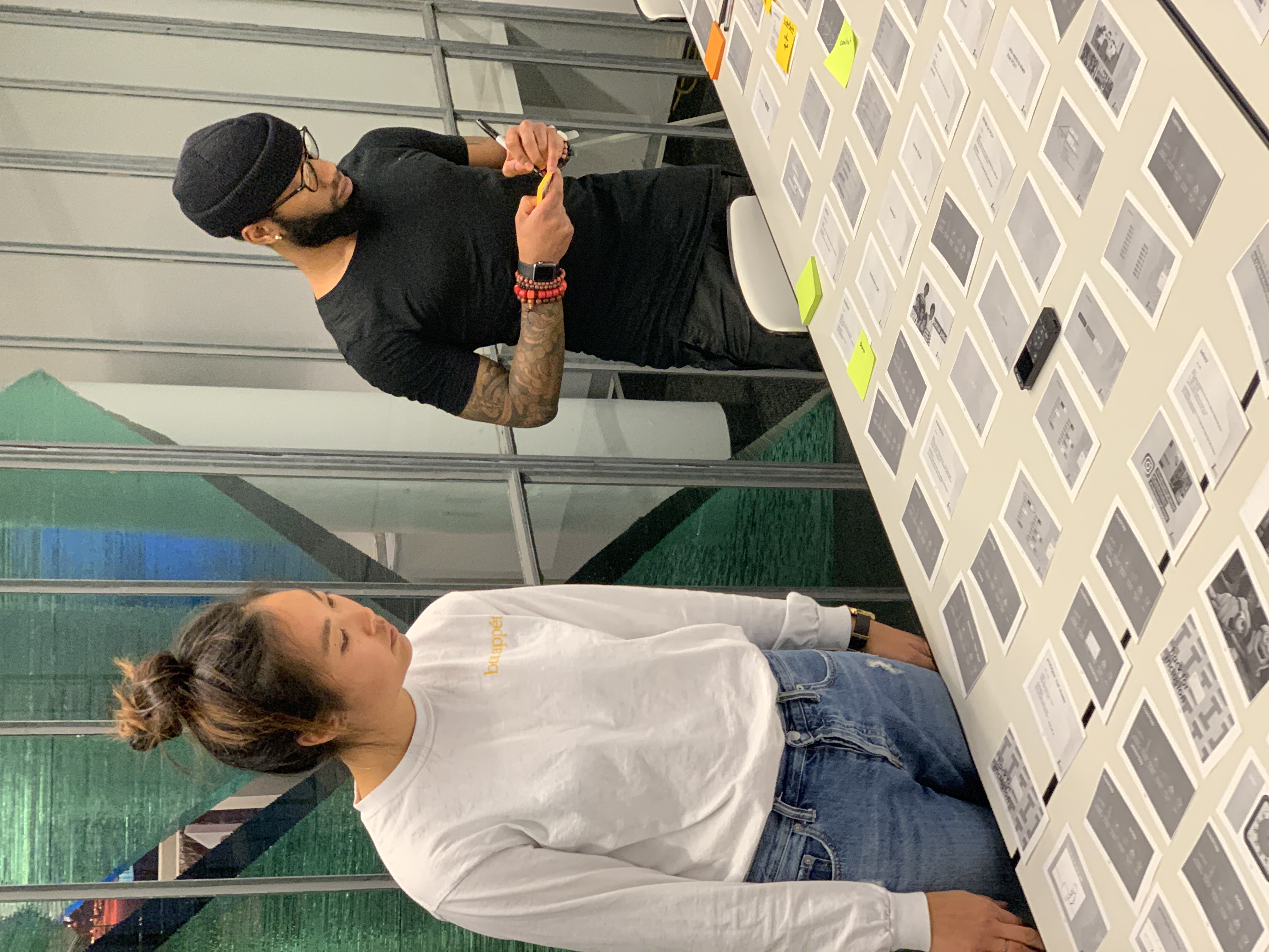
As one of two designers on our team, I led the initial empathy-building exercises, capturing insights through careful observation and structured interviews. I also established the framework for our brainstorming sessions, selection methodology, brand direction, and physical interface approach. This holistic involvement provided a rare opportunity to guide a product from initial concept through to market introduction, with clear metrics for success: sales volume and profit margins.

This project wasn't merely an academic exercise but a practical demonstration of how design methodologies can translate directly to market outcomes. The challenge required balancing creative exploration with rigorous assessment of manufacturability, cost considerations, and market positioning—all essential elements of successful product development.

II - ORIENTATION

To establish clear parameters for our design exploration, I defined five constraint principles that would guide our process:

[1] aesthetics would be paramount—recognizing that users deeply value how a serving object both appears independently and enhances what is placed upon it.

[2] shape possibilities would remain open—acknowledging the remarkable diversity of successful forms in this category, from geographic outlines to abstract configurations.

[3] consideration would extend beyond food to include utensils—recognizing that the complete experience encompasses both the items served and the tools used for serving and consumption.

[4] material selection would be approached as an emotional decision—understanding that different materials evoke different responses and must align with the intended experience.

[5] pricing would be recognized as a function of multiple variables—materials, dimensions, personalization, construction methodology, and aesthetic refinement.

Our research methodology combined direct engagement with potential users in retail environments with structured interviews involving twelve "kitchen dwellers"—individuals who regularly prepared or managed kitchen tasks. This dual approach provided insights into both purchasing considerations and day-to-day usage patterns.

III - EXPLORATION

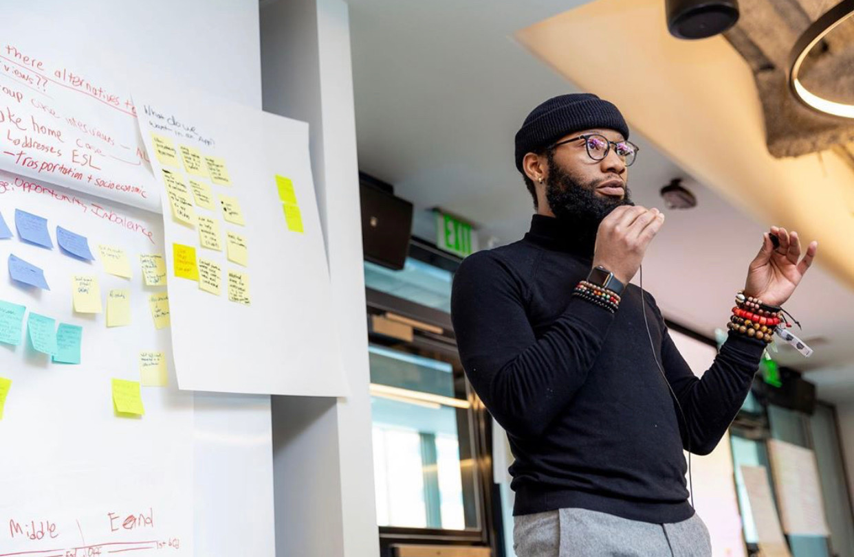
With clear user priorities established, we oriented our design direction around beauty and quality as primary considerations. We sought to evoke specific emotional responses, creating a vocabulary of descriptors—"rustic," "elevated," "artisanal," "elegant," and "modern"—that would guide our aesthetic development. These words weren't arbitrary but derived directly from user expressions during our research phase.

Our exploration encompassed three distinct categories: bowl-like vessels, trays and boards, and modular systems. Each category was evaluated against comprehensive criteria addressing desirability, feasibility, and viability. The "Trays + Boards" category emerged as most promising across these dimensions, offering both creative potential and practical viability.

Within this category, we developed multiple concepts through rapid prototyping using diverse materials—wood, foam, metal—analyzing both aesthetic impact and production feasibility. This process revealed a particularly compelling insight: the combination of metal and wood created an especially positive response among users, highlighting the contrast between machined precision and natural warmth.

IV - MEETING

As our prototyping progressed, we refined our material exploration based on both user feedback and manufacturing considerations. Various metal finishes, handling methods, and dimensional options were systematically evaluated, along with different wood varieties and treatment approaches.

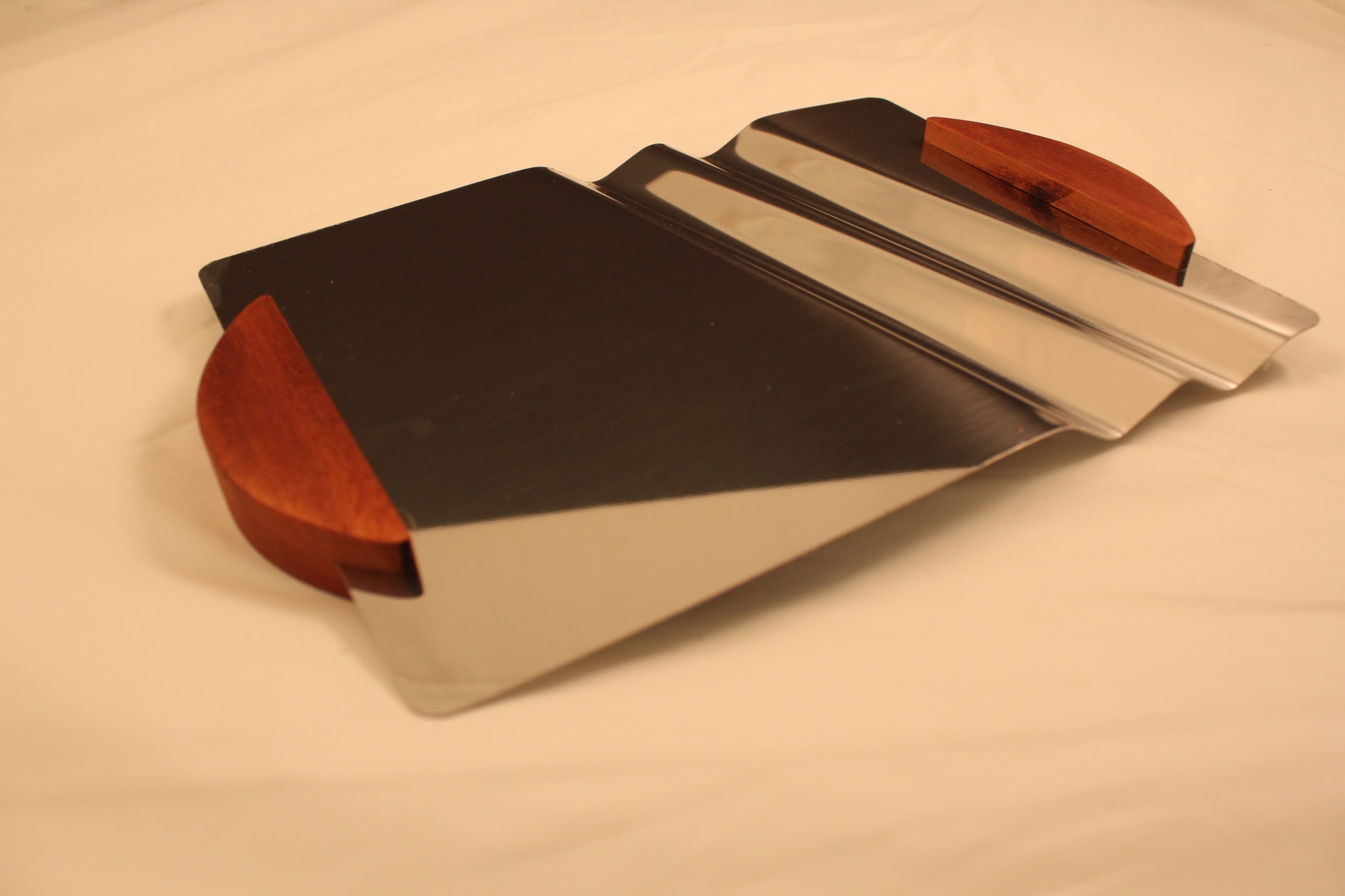
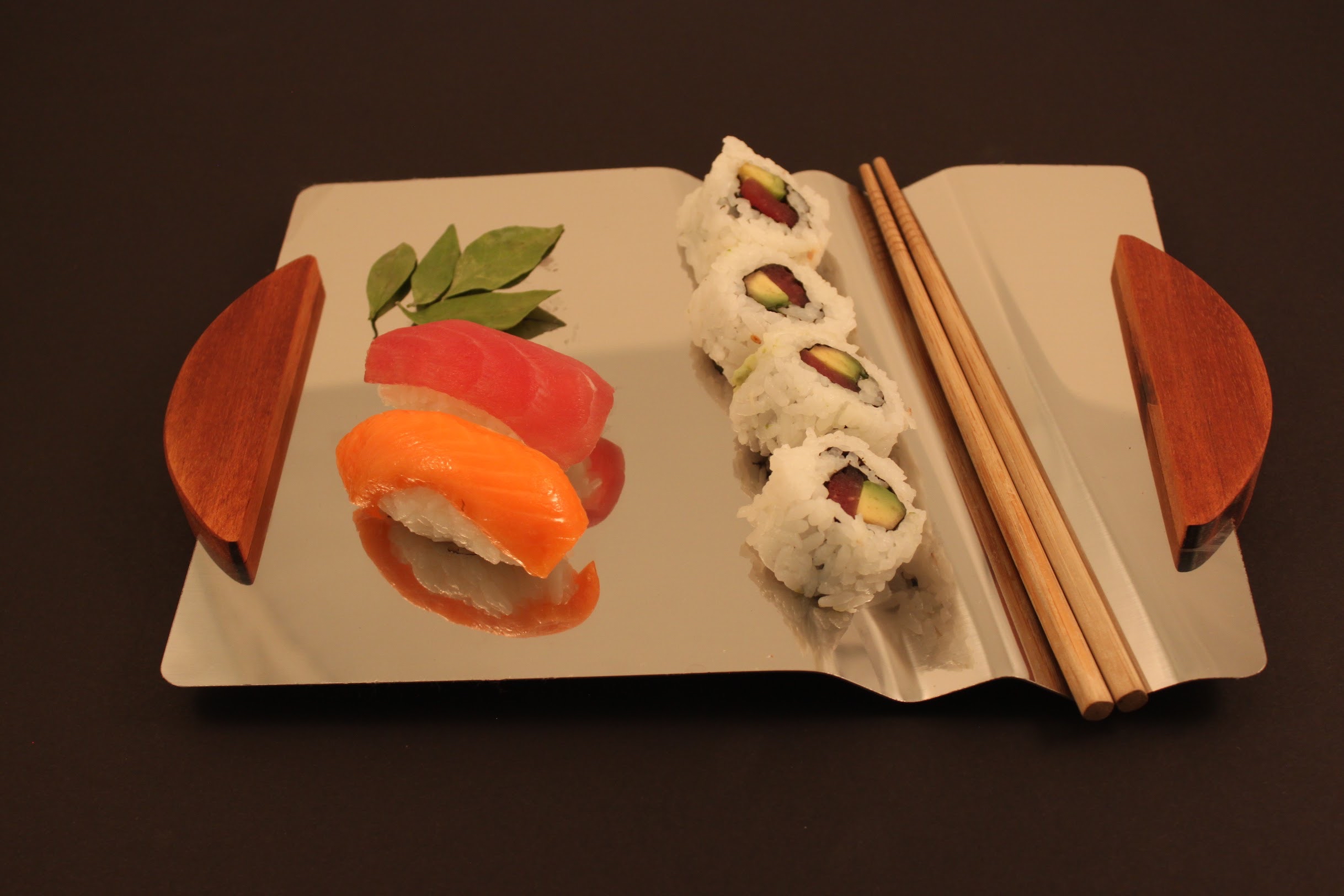
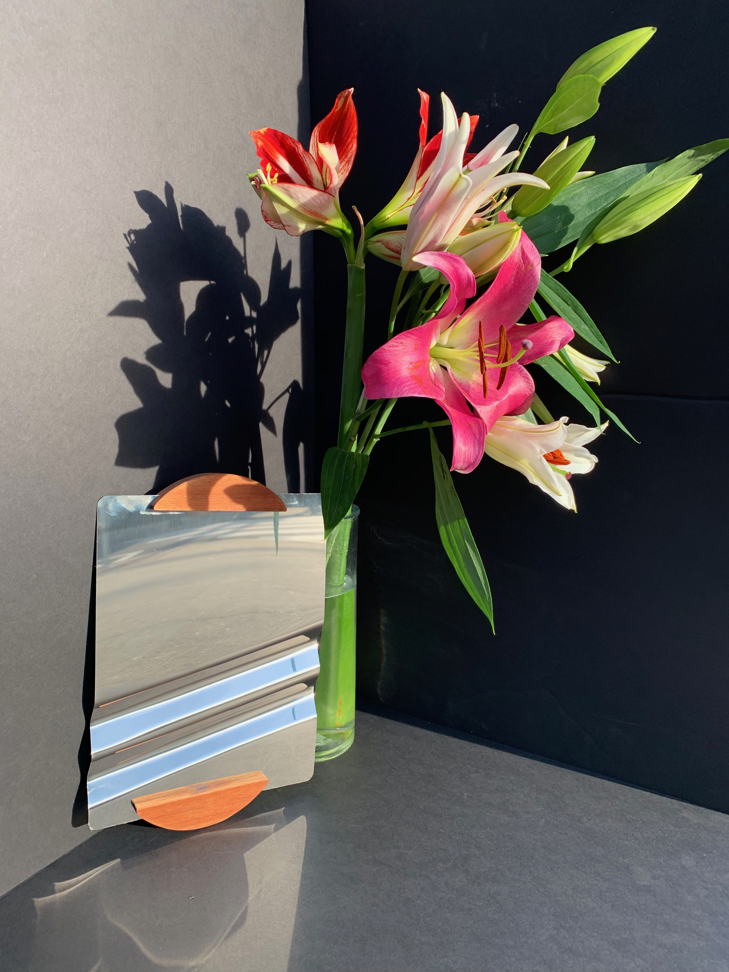
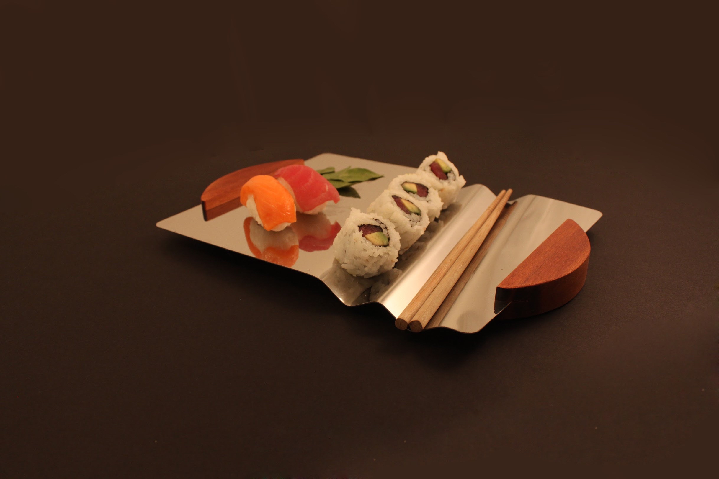
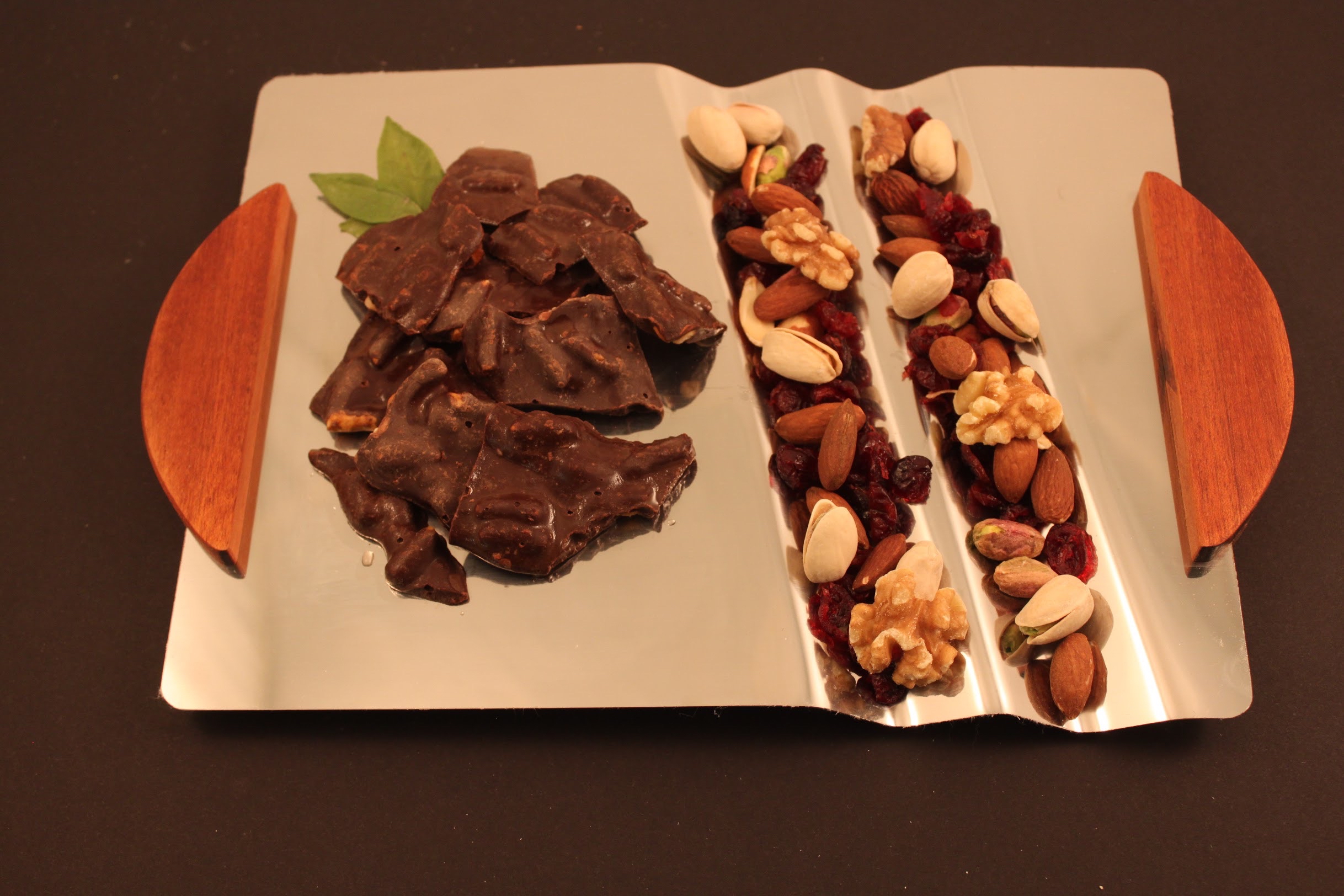
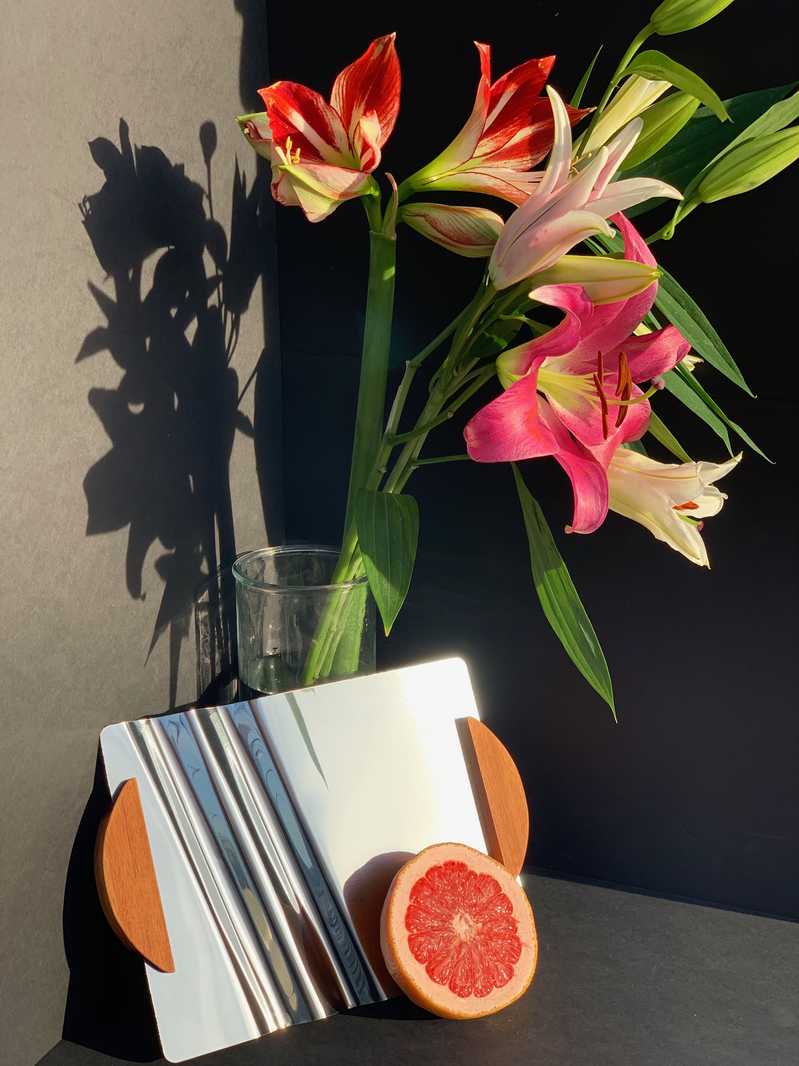
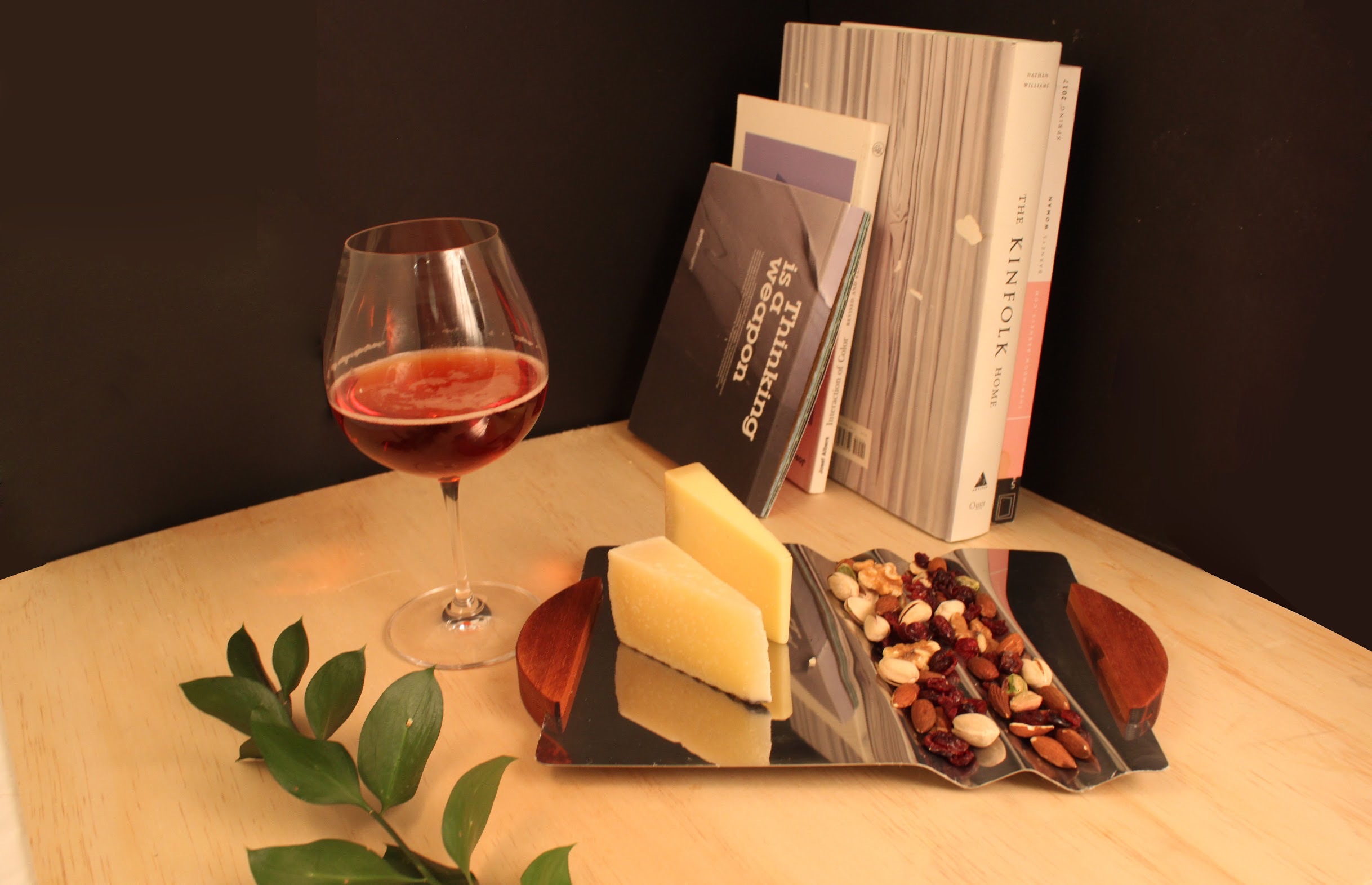
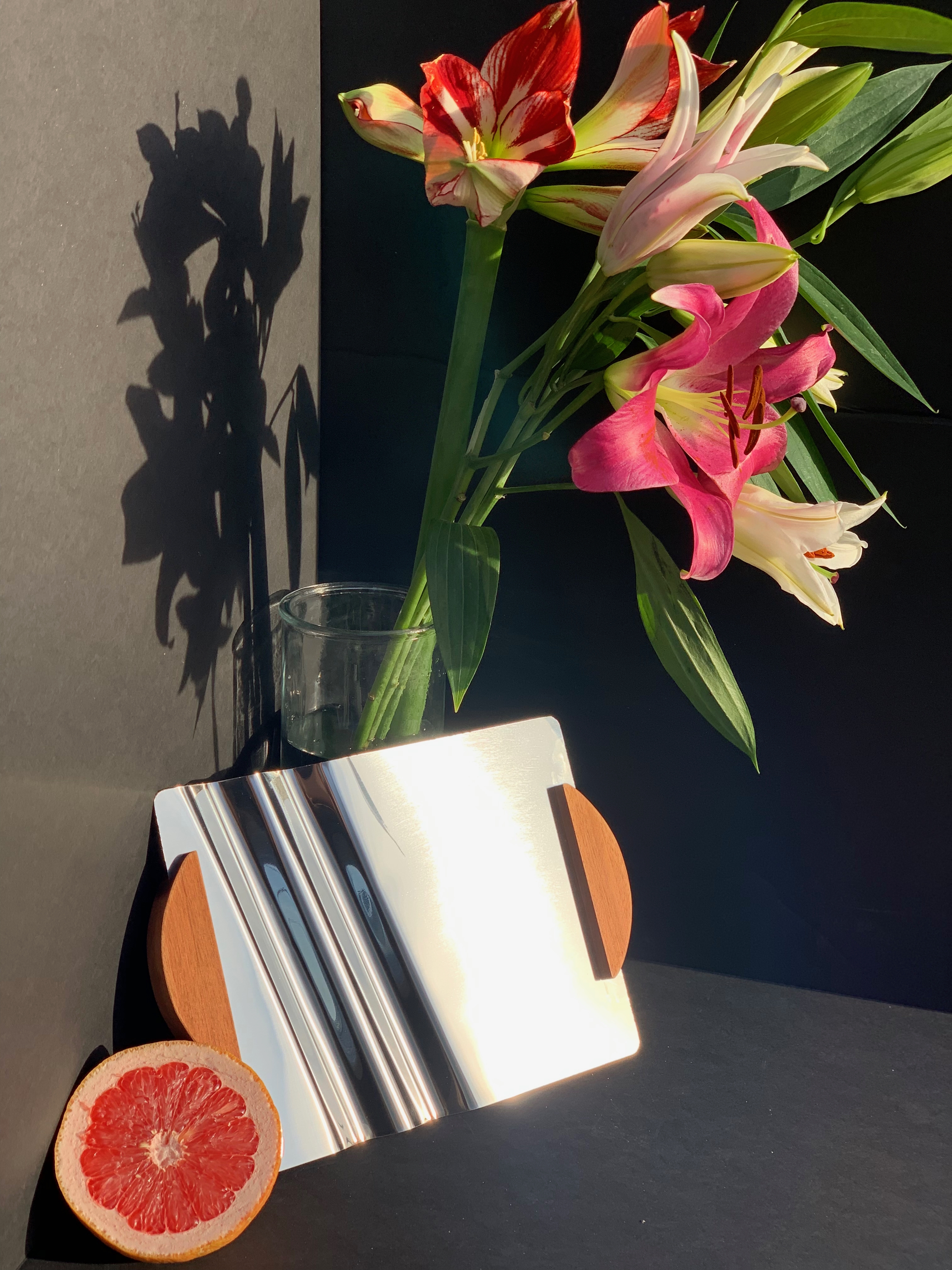
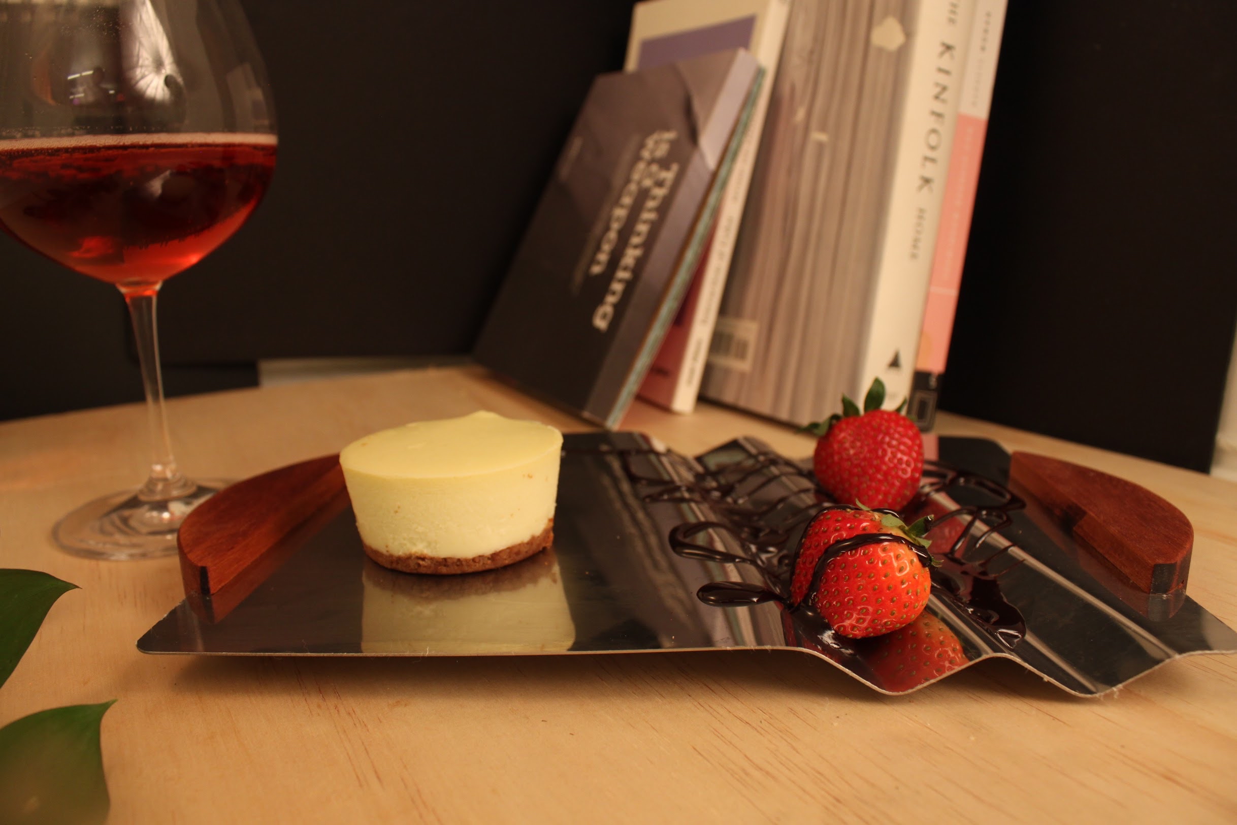
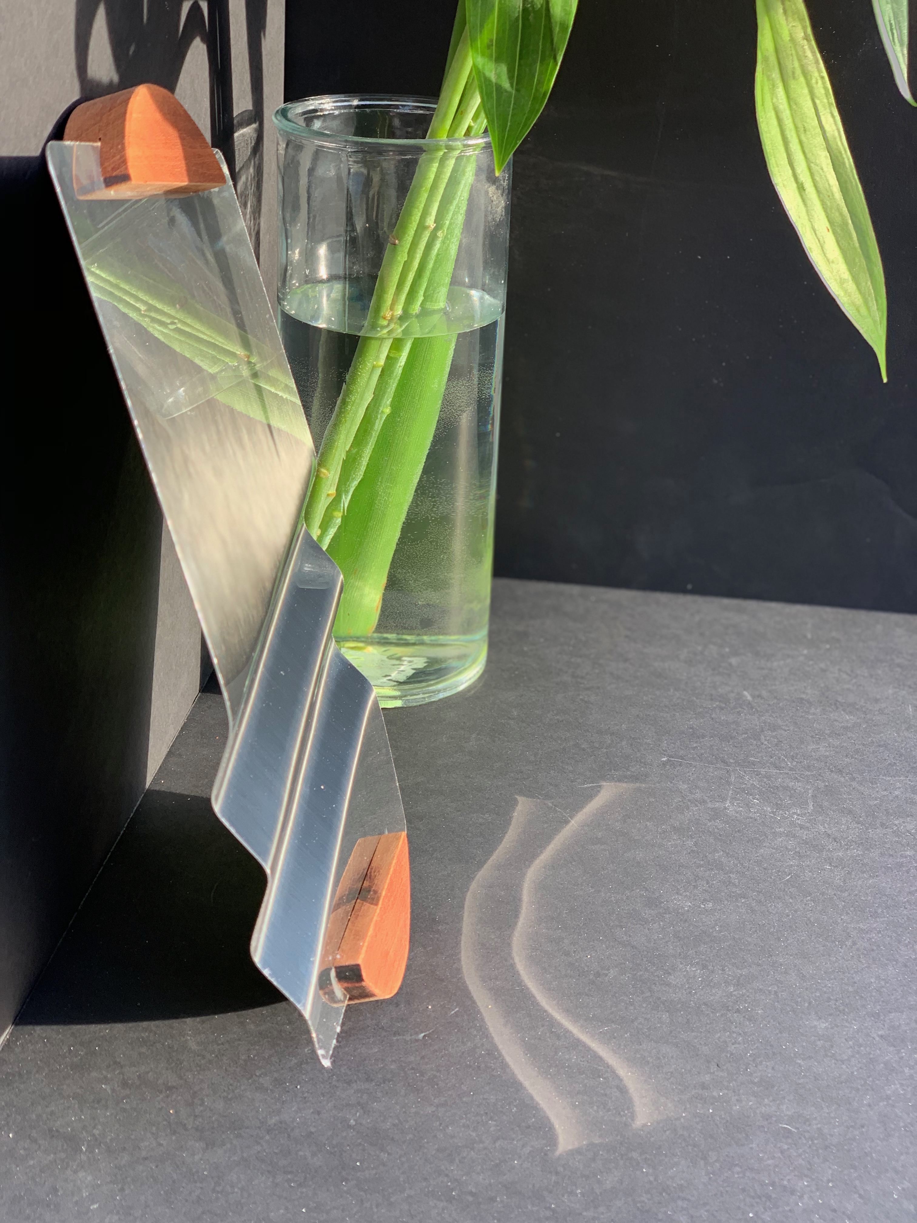
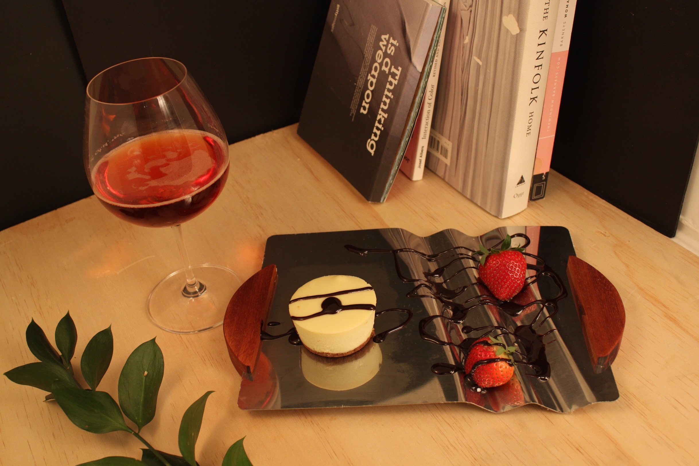
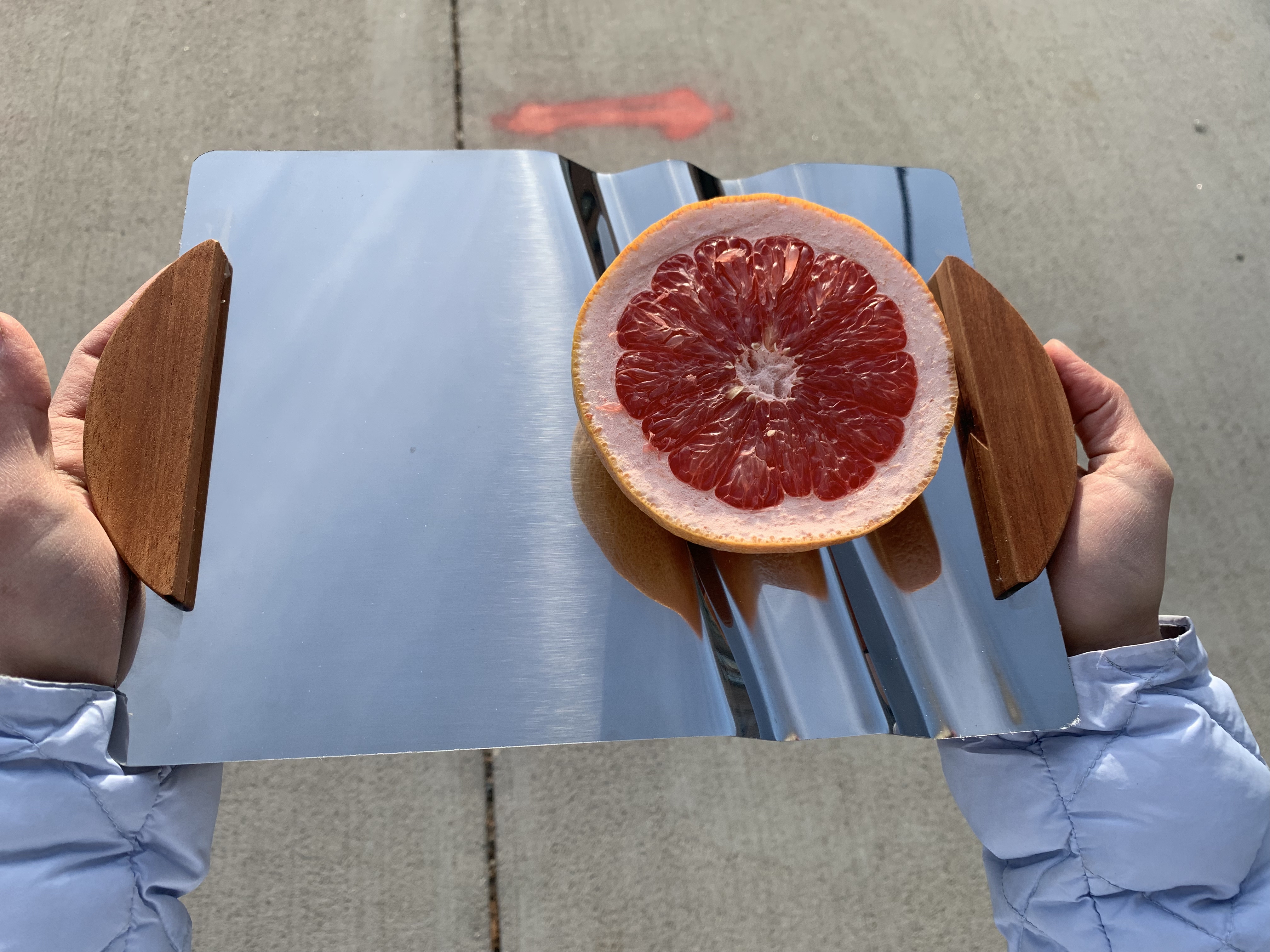
This methodical assessment led us to a specific combination: red oak and galvanized steel. This pairing achieved the necessary visual and tactile contrast we sought, embodying both "hand-worked" craftsmanship and "machined" precision. The materials complemented each other not only aesthetically but functionally, each contributing distinct properties to the overall experience.

The selection wasn't arbitrary but the result of careful consideration of how different materials would influence perceptions, interact with food items, maintain their appearance over time, and contribute to the overall narrative of our product.

V - CO-DESIGN

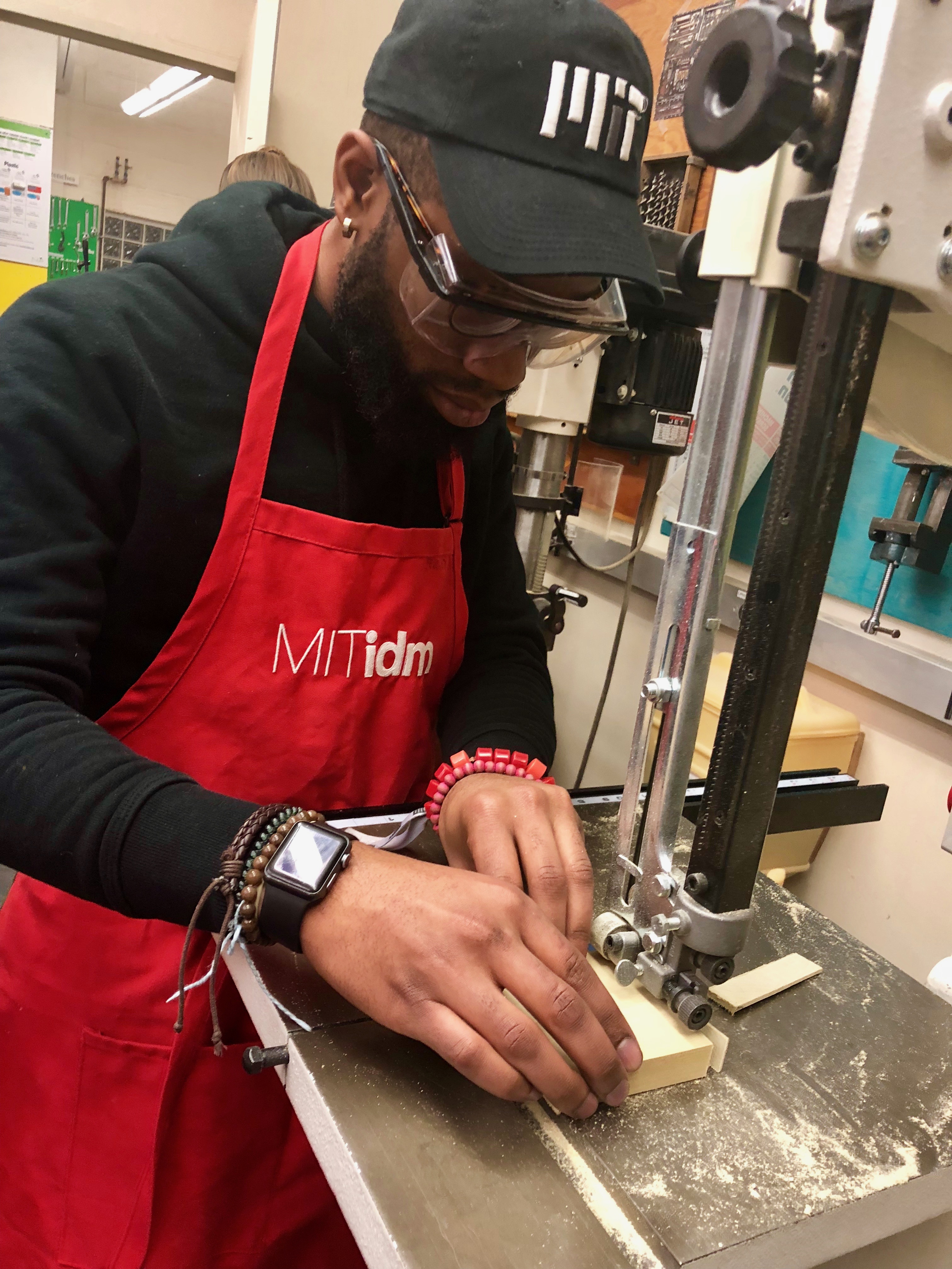
The manufacturing process became an integral part of our design development, with our engineering team establishing scalable methods for both metalworking and woodworking. Interestingly, wood played a dual role in our process—serving both as a component of the final product and as a tooling element during production, with wooden braces created to uniformly press and bend the steel sheets.

This integration of manufacturing considerations into the design process ensured that our aesthetic vision remained aligned with production realities—a critical factor in successfully bringing a physical product to market within a compressed timeframe.

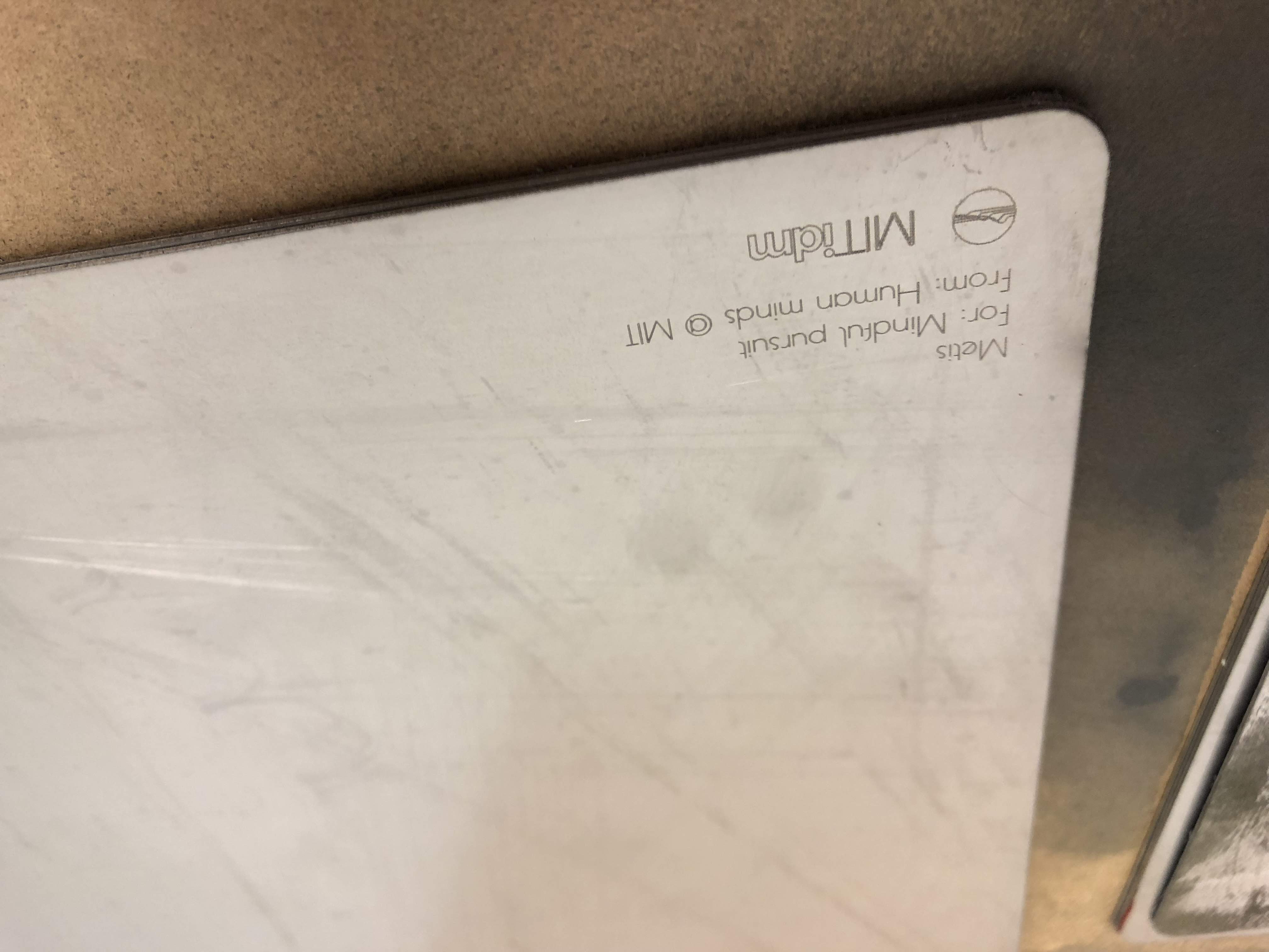
In finalizing our design, we incorporated subtle refinements based on user feedback, including the addition of two wooden ergonomic handles that enhanced functionality while reinforcing our material narrative. We also developed complementary brand elements, including a logo that embraced the descriptive term "wavy"—a reference that resonated in our market research as an expression of approval and desirability.

VI - ROLL-OUT

The final product achieved a careful balance between aesthetic refinement and functional performance, between crafted warmth and precision engineering. This balance wasn't accidental but the result of systematic development guided by clear principles and continuous user feedback.

The market response validated our approach, with our team winning the overall competition, generating over $ 30,000 in revenue, and selling more than 70 units within the specified timeframe. This outcome demonstrated not only the appeal of our specific design but the effectiveness of our overall methodology—a structured approach to product development that balanced creative exploration with market realities.

The METIS tray project illustrates how design thinking, when applied comprehensively across the product development process, can create objects that resonate with users while achieving tangible business outcomes. By maintaining a clear focus on user needs while systematically addressing technical and market considerations, we created a product that succeeded both as a design statement and as a commercial proposition.

2018.Q3
Frame
Manufacture
Sell
2018.Q4
Venture Design
Physical Development
Creative Direction
Brand Strategy
TANGIBLE UI/UX
ARTIFACTS
Slowest
Slow
Default
Fast
Fastest
METIS Product Display

Product concept visualization

Design showcase

METIS Usage Demonstration

User interaction model

Product demonstration

METIS Design Process

Manufacturing process

Production documentation

METIS Prototype Testing

User testing documentation

Iterative design process

METIS Material Exploration

Material selection

Fabrication techniques

METIS Marketing Materials

Marketing assets

Brand communication

METIS User Research

User research findings

Insight development

METIS Production Line

Production setup

Manufacturing implementation

METIS Team Collaboration

Team collaboration

Design workshop

METIS Design Sketches

Concept sketches

Initial ideation

METIS Brand Development

Brand identity

Visual language development

METIS User Feedback

User feedback collection

Product validation

METIS Sales Analysis

Sales performance

Market penetration

METIS Final Showcase

Product showcase

Exhibition display

METIS Award Ceremony

Recognition & awards

Project outcome

##

MW

##

OTHER WORK

Miscellaneous

Various projects framing novel use-cases and touching users across the globe.

explore overview
viewing other work

This collection showcases a variety of smaller projects and explorations that demonstrate versatility across different design disciplines and client contexts. These pieces represent experimental work, rapid prototypes, and specialized solutions for unique challenges.

While each project had a more limited scope than the featured case studies, they all applied the same rigorous design methodology and attention to detail that characterizes my broader portfolio. (For more on where these projects had impact, visit the 'more on me' section in the site's header!)

UI Design
UX Design
Product Design
Product Strategy
Tech Innovation
Design Strategy
Design Thinking
MISCELLANEOUS
ENQUIRIES

Concept exploration

Interaction prototypes

Visualization experiments

Emerging technology interfaces

Service design

System architecture

Concept exploration

Interaction prototypes

Design system components

Pattern library

Prototype testing

Validation exercises

Interactive case studies

Research documentation

Design system components

Pattern library

LOADING CONTENT